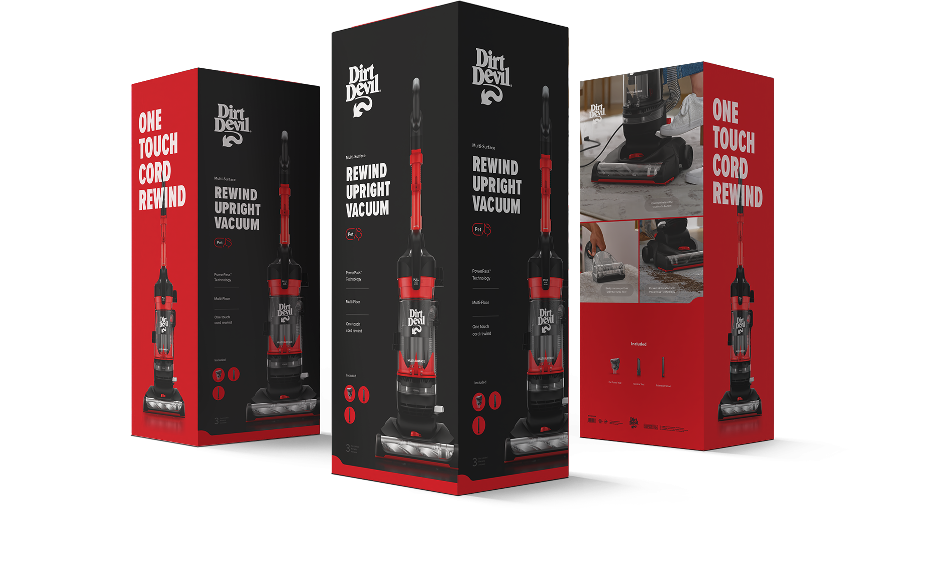
Dirt Devil®
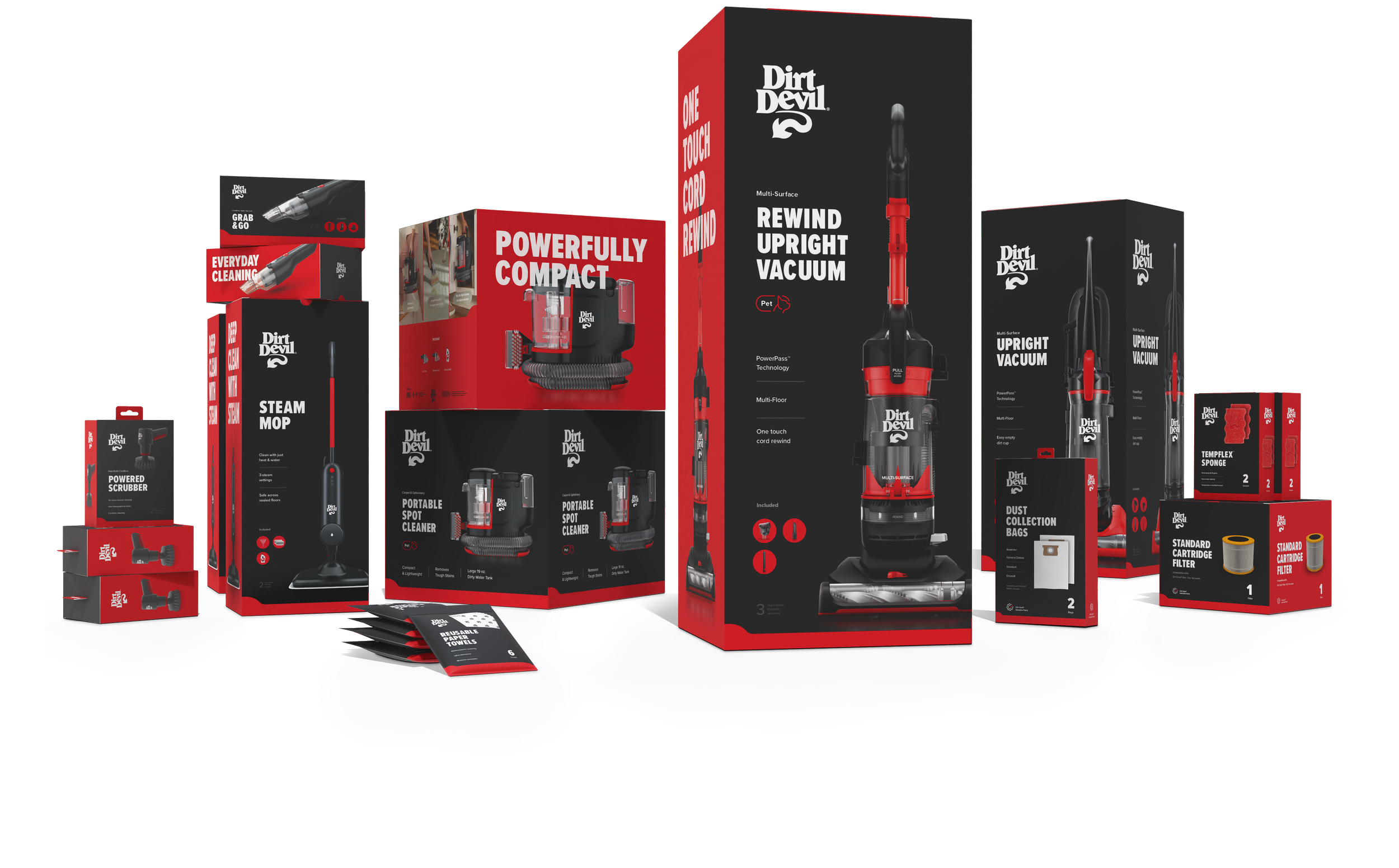
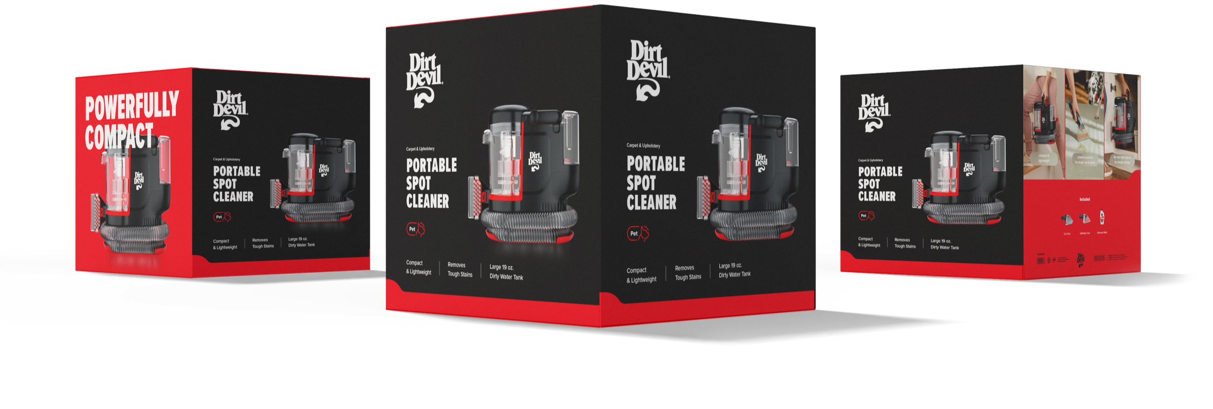
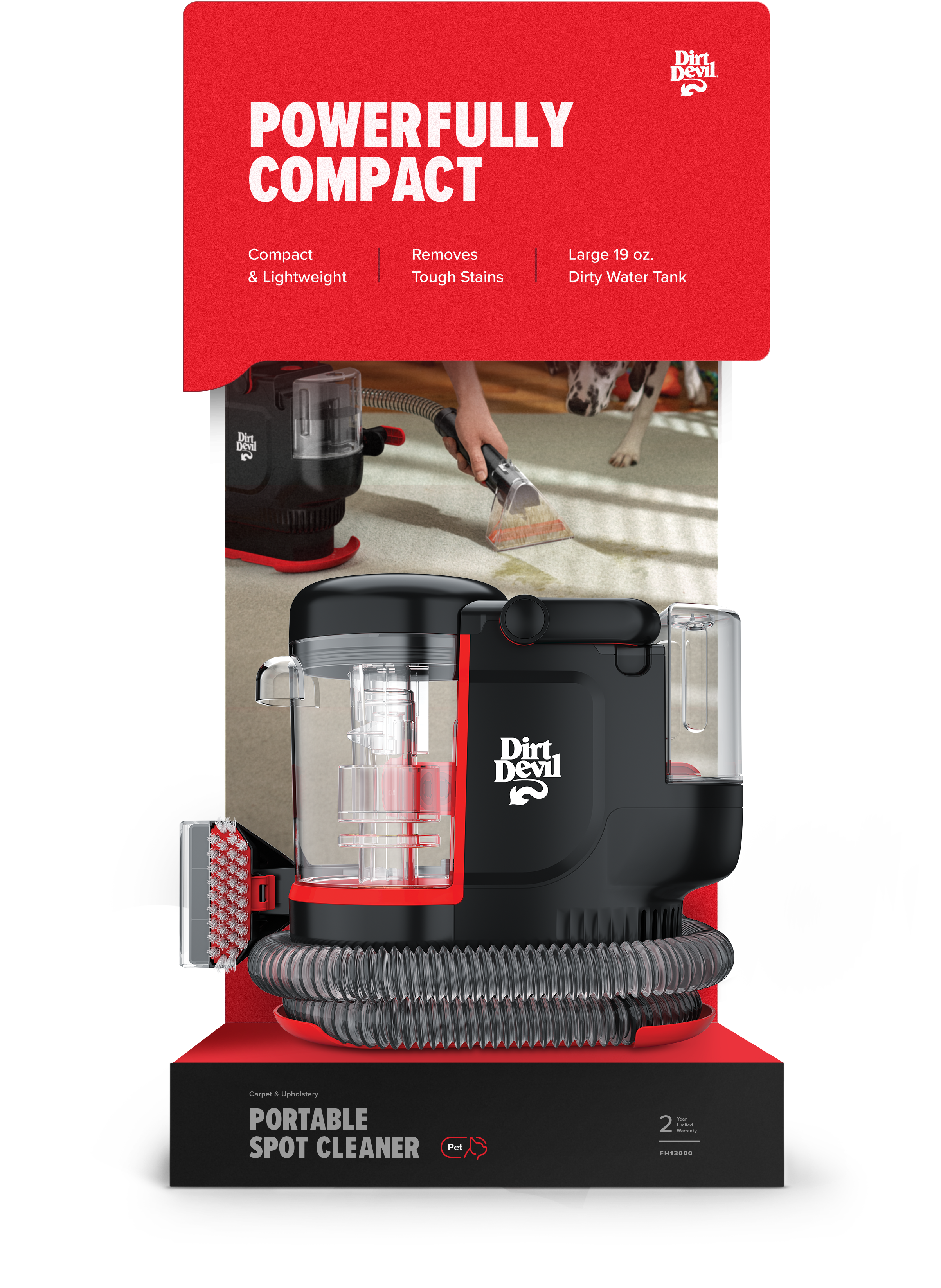
The Dirt Devil Visual Brand Language (VBL) refresh establishes a bold, cohesive VBL that unites every product category under one clear identity. The system strengthens shelf presence through confident color, strong hierarchy, and clear communication of product benefits. Each design helps consumers instantly understand value and performance while ensuring Dirt Devil stands out across retail environments.
Packaging / Print Collateral / Signage & Environmental
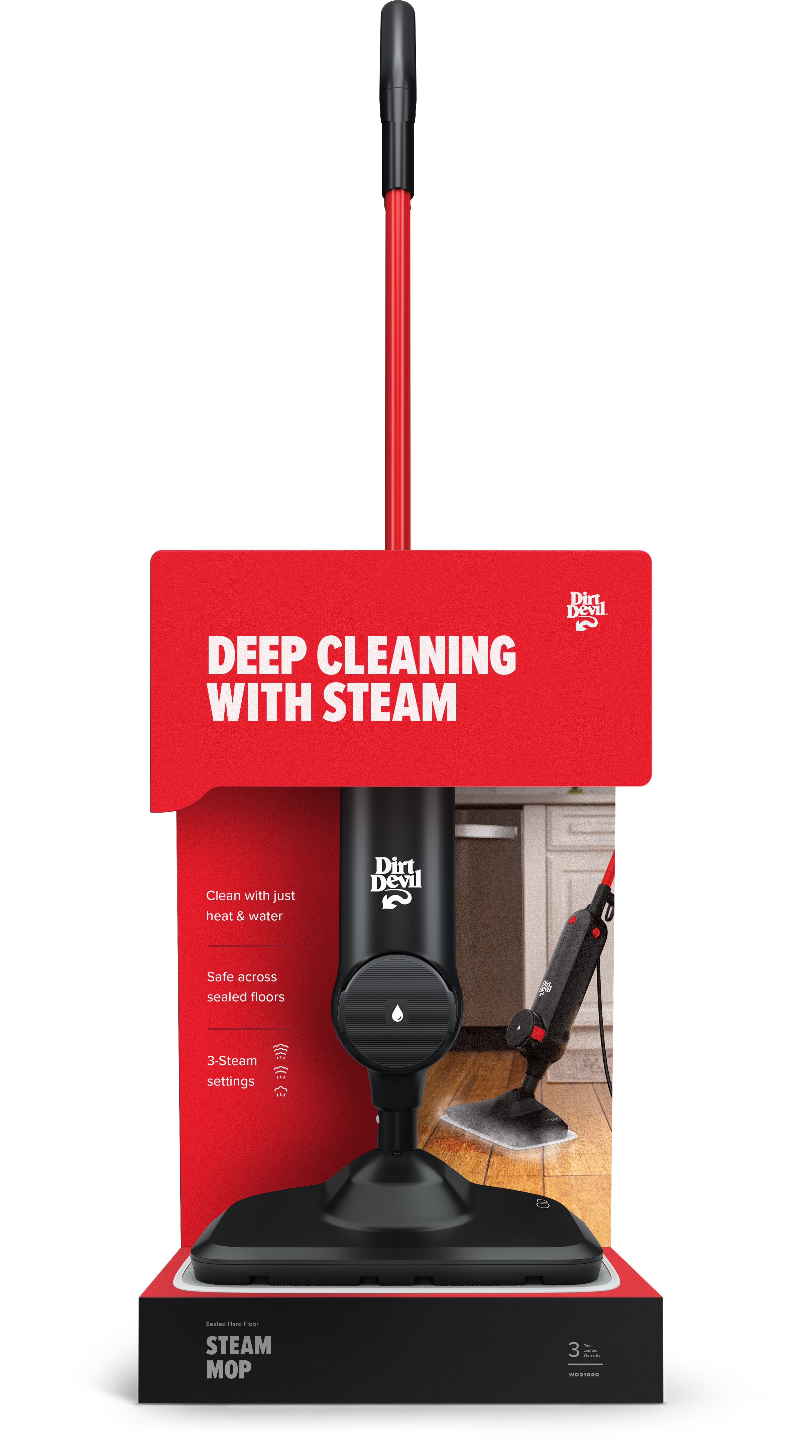
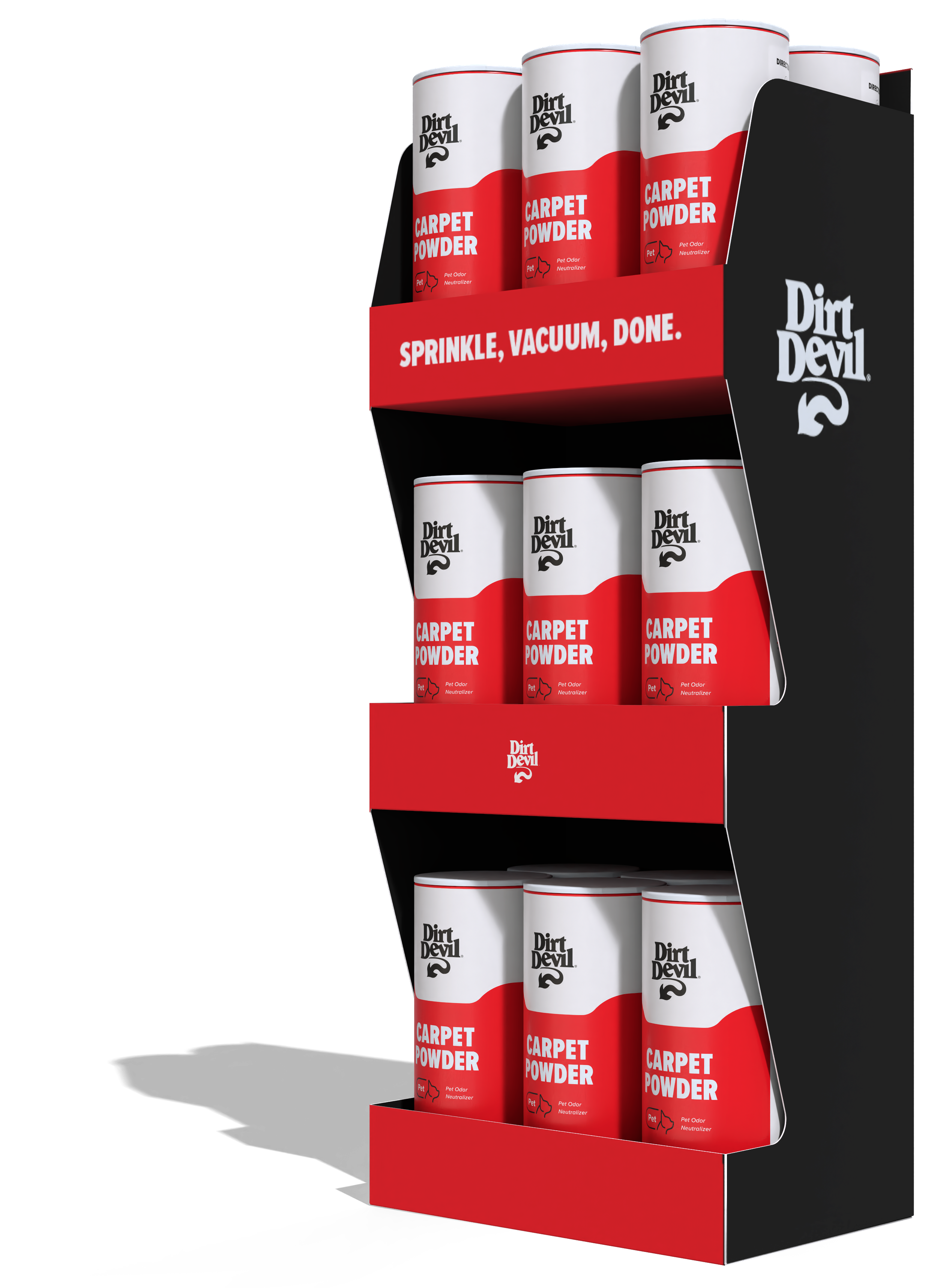
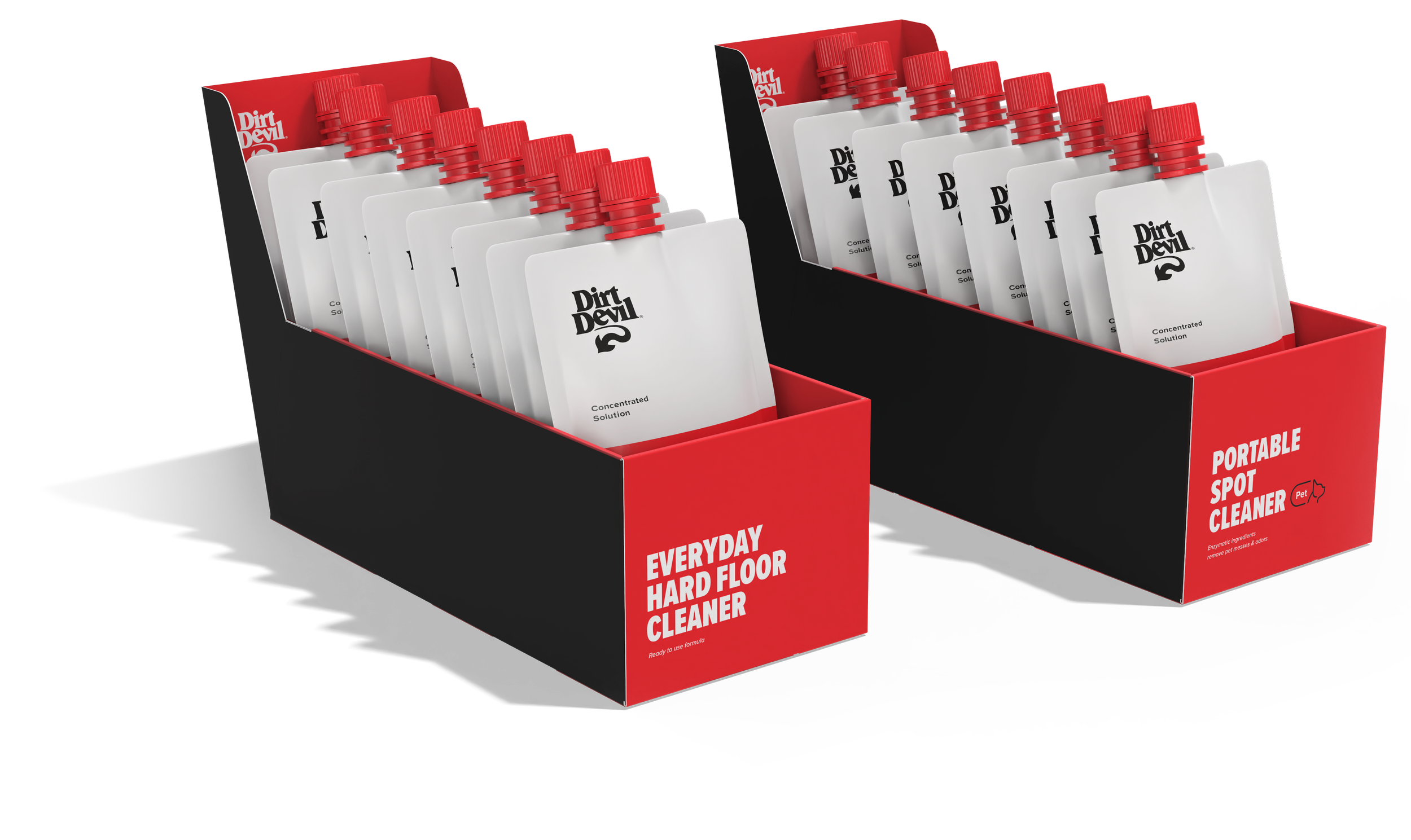
Point of Purchase Displays
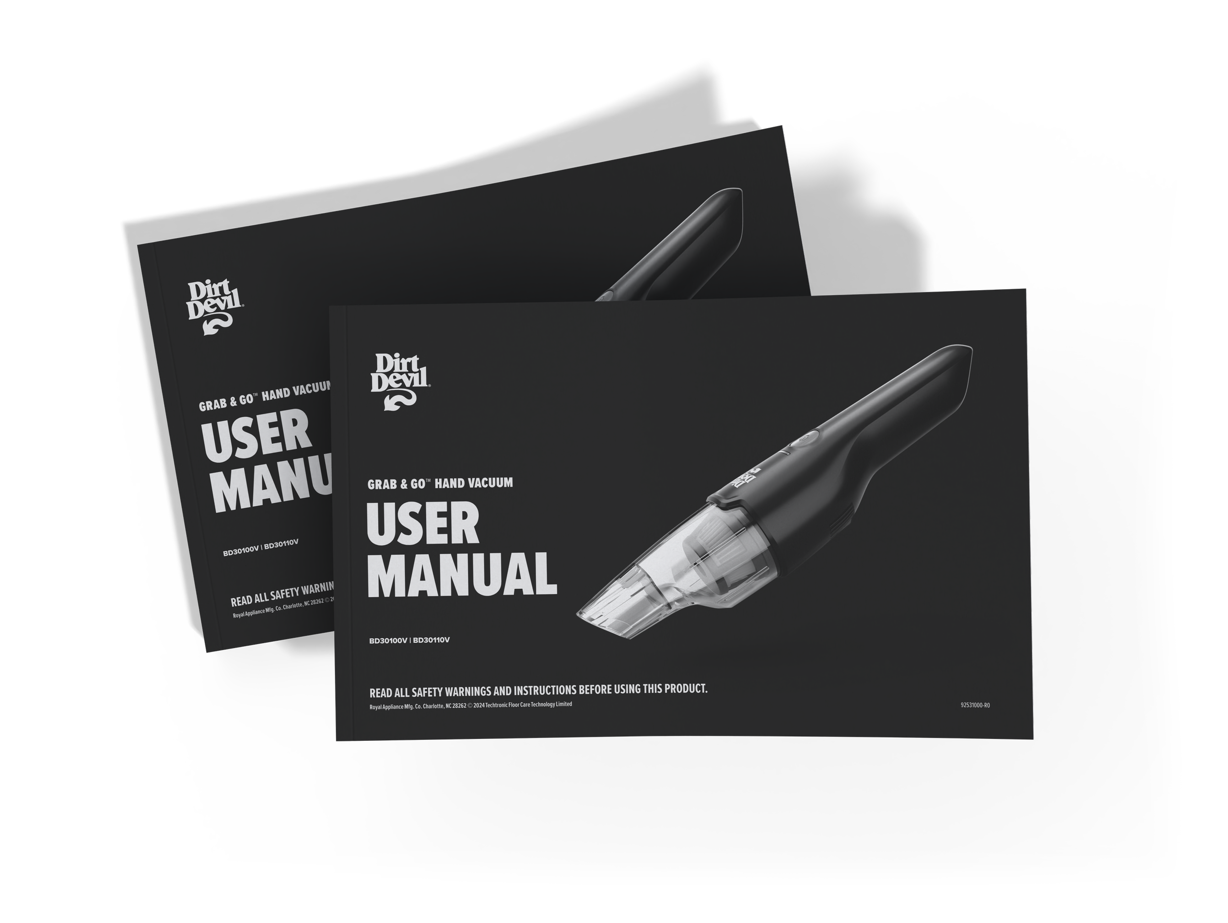
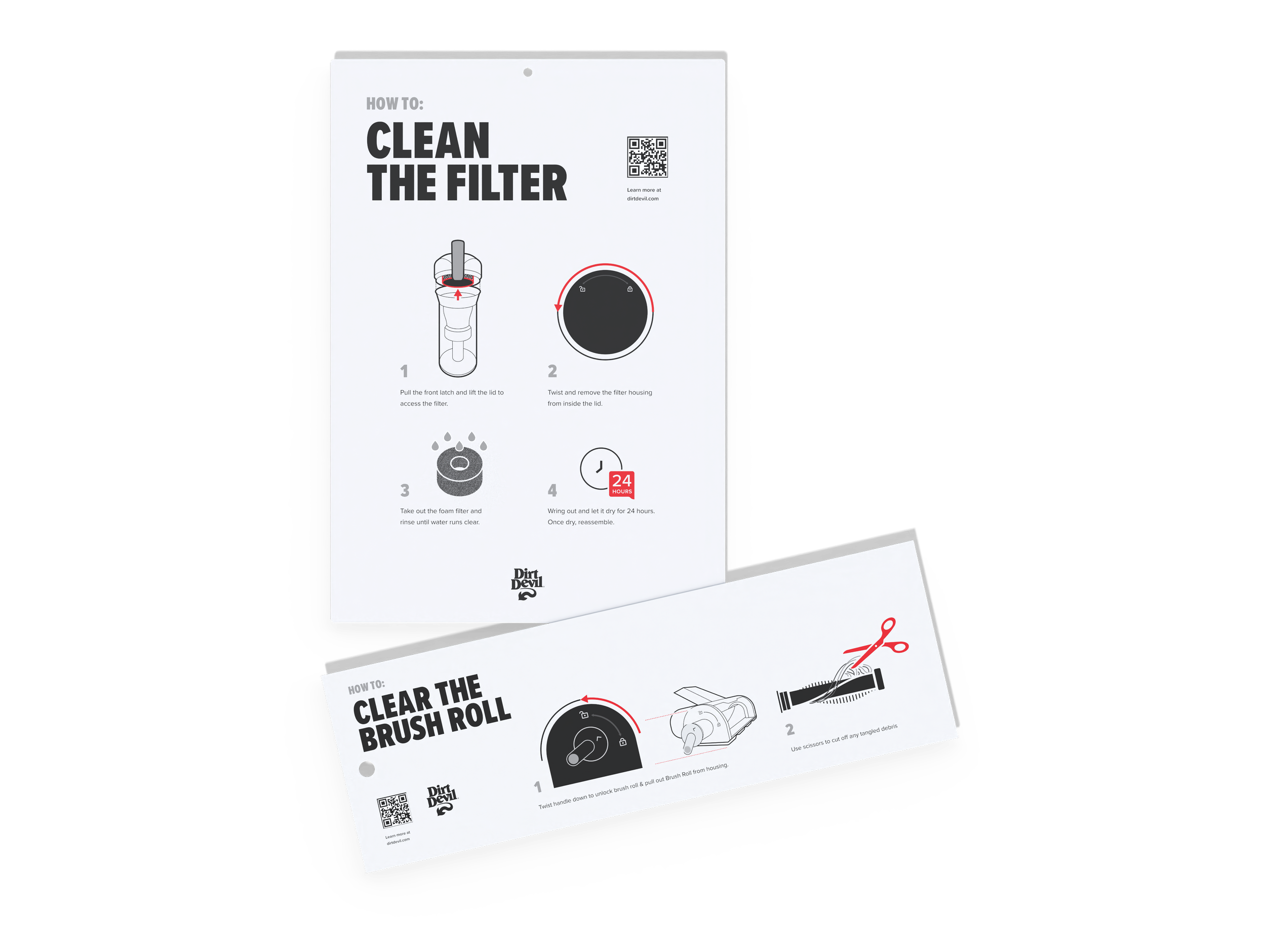
User Manuals / Maintenance Tips
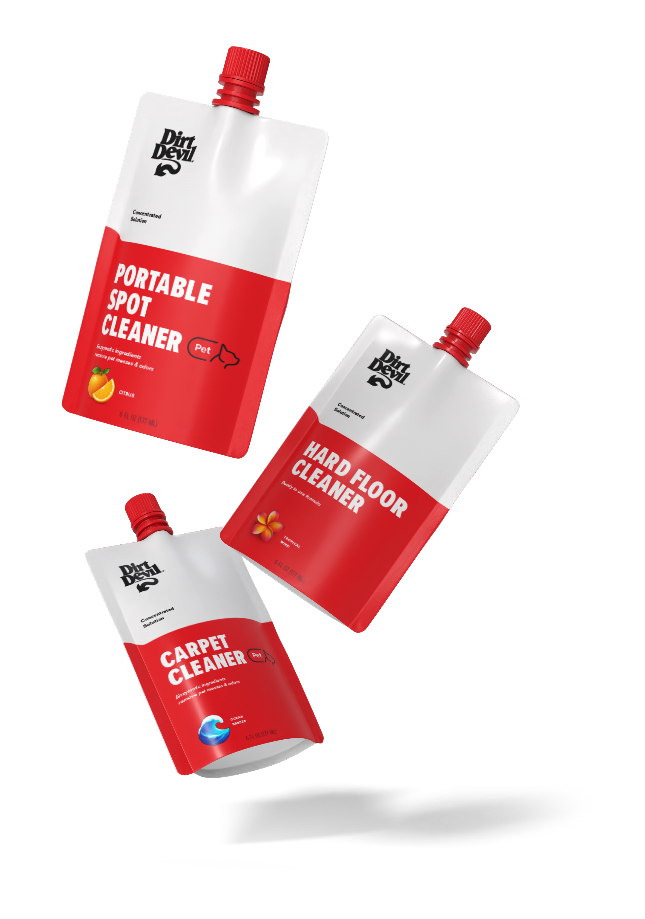
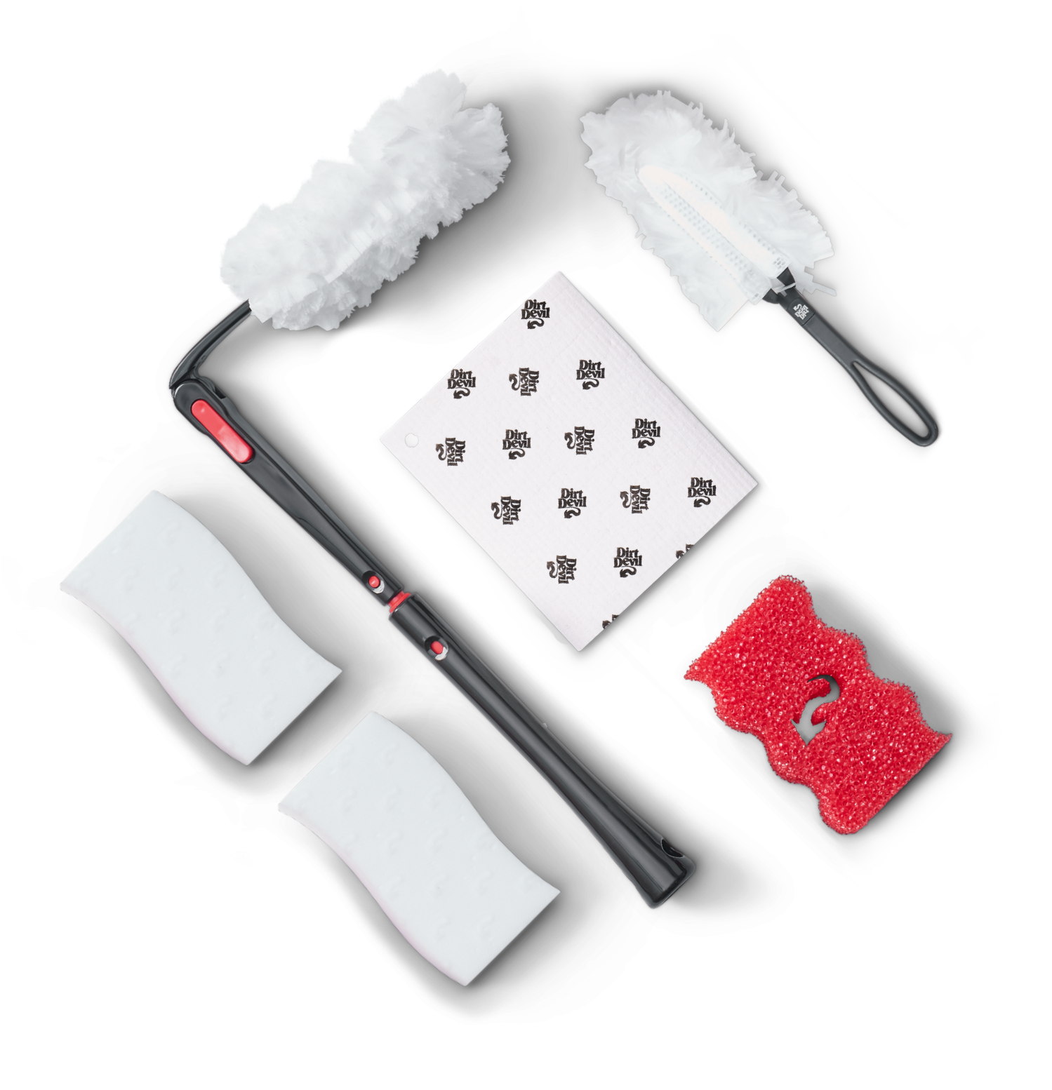
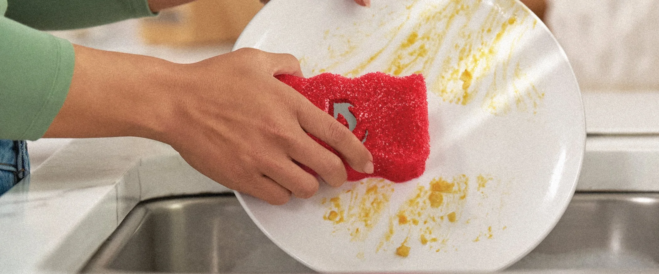
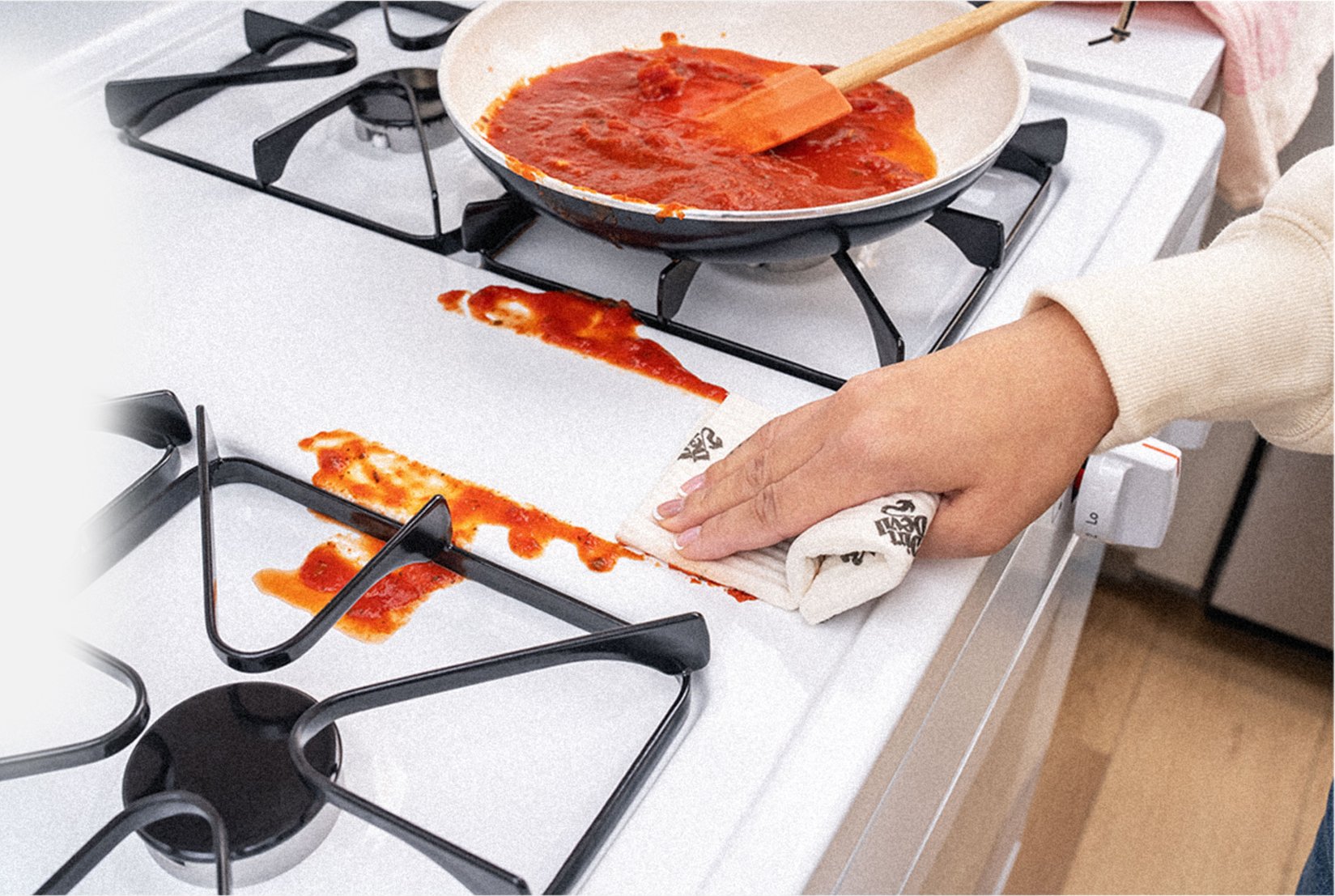
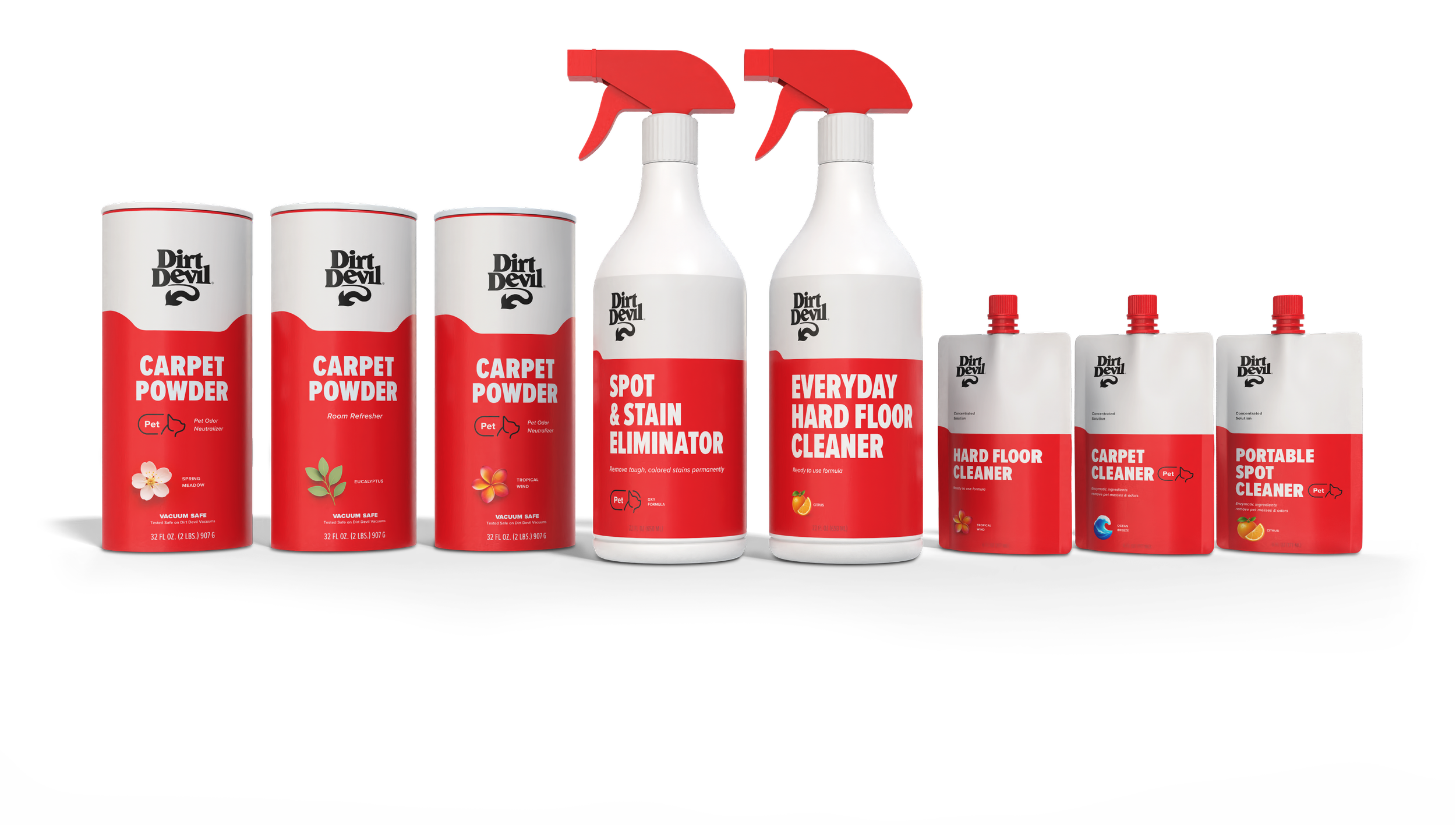
Formulas
For the Dirt Devil formula line, the packaging moved from a predominantly black design with red accents to a brighter white-led palette. The new direction creates a cleaner, more approachable look that feels fitting for products focused on care and protection. Using white as the foundation brings a sense of safety and trust, while the bold red accents maintain the energy and confidence that define the Dirt Devil brand.
Formula Point of Purchase

Creative Director: Sean-Paul Brown
Photography/CGI: Gary Hughes