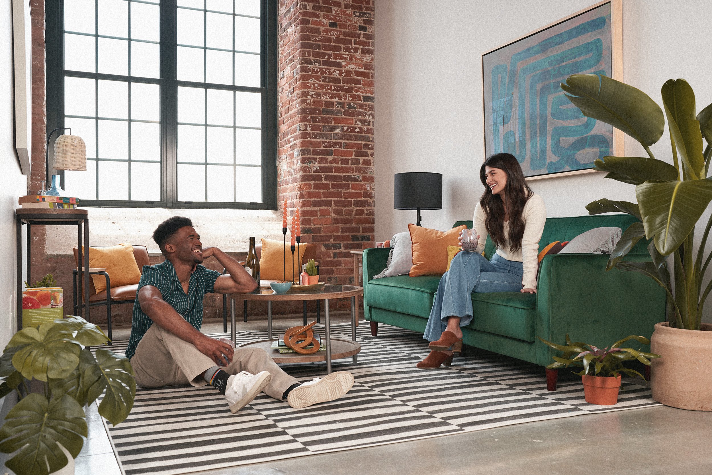
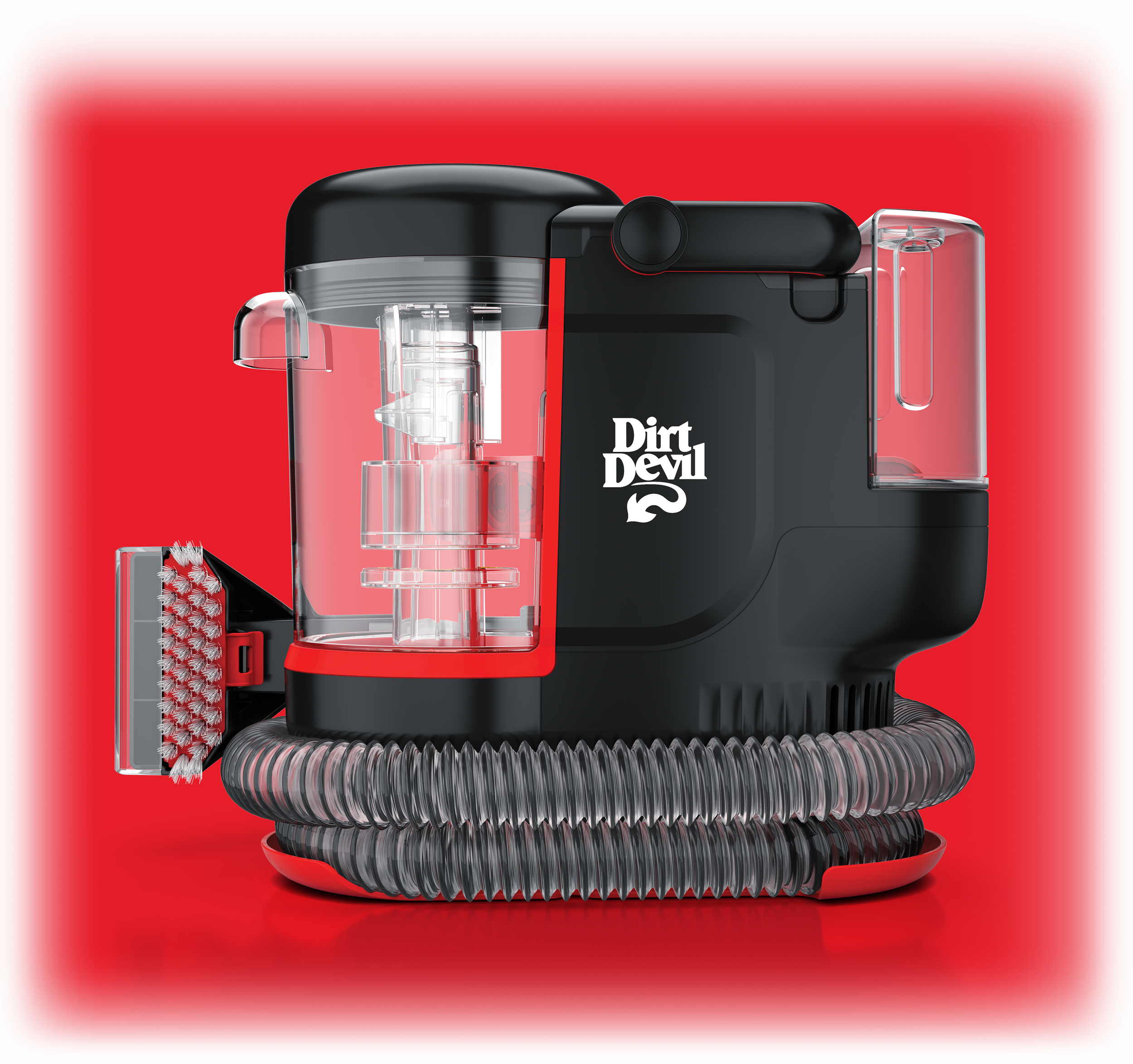
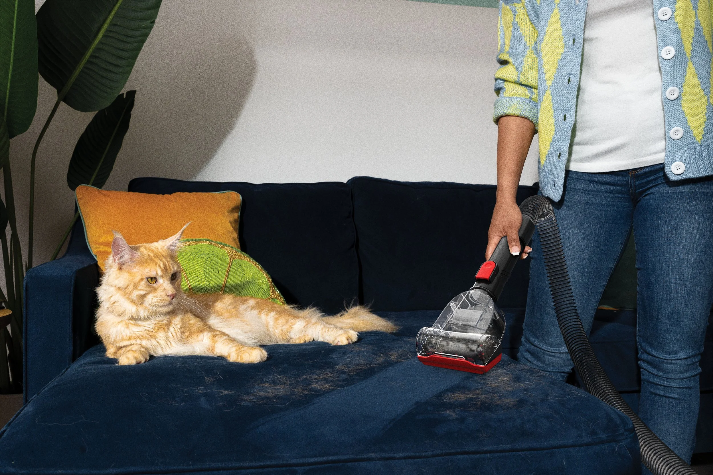
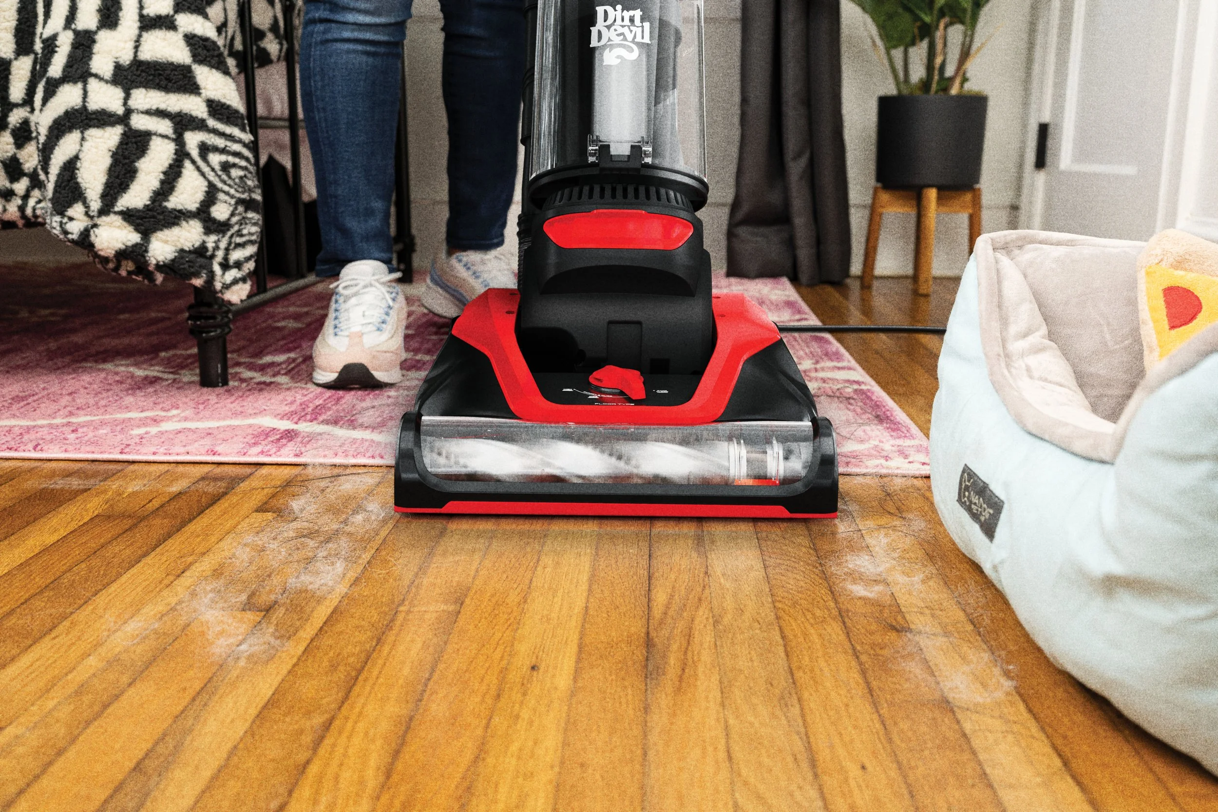
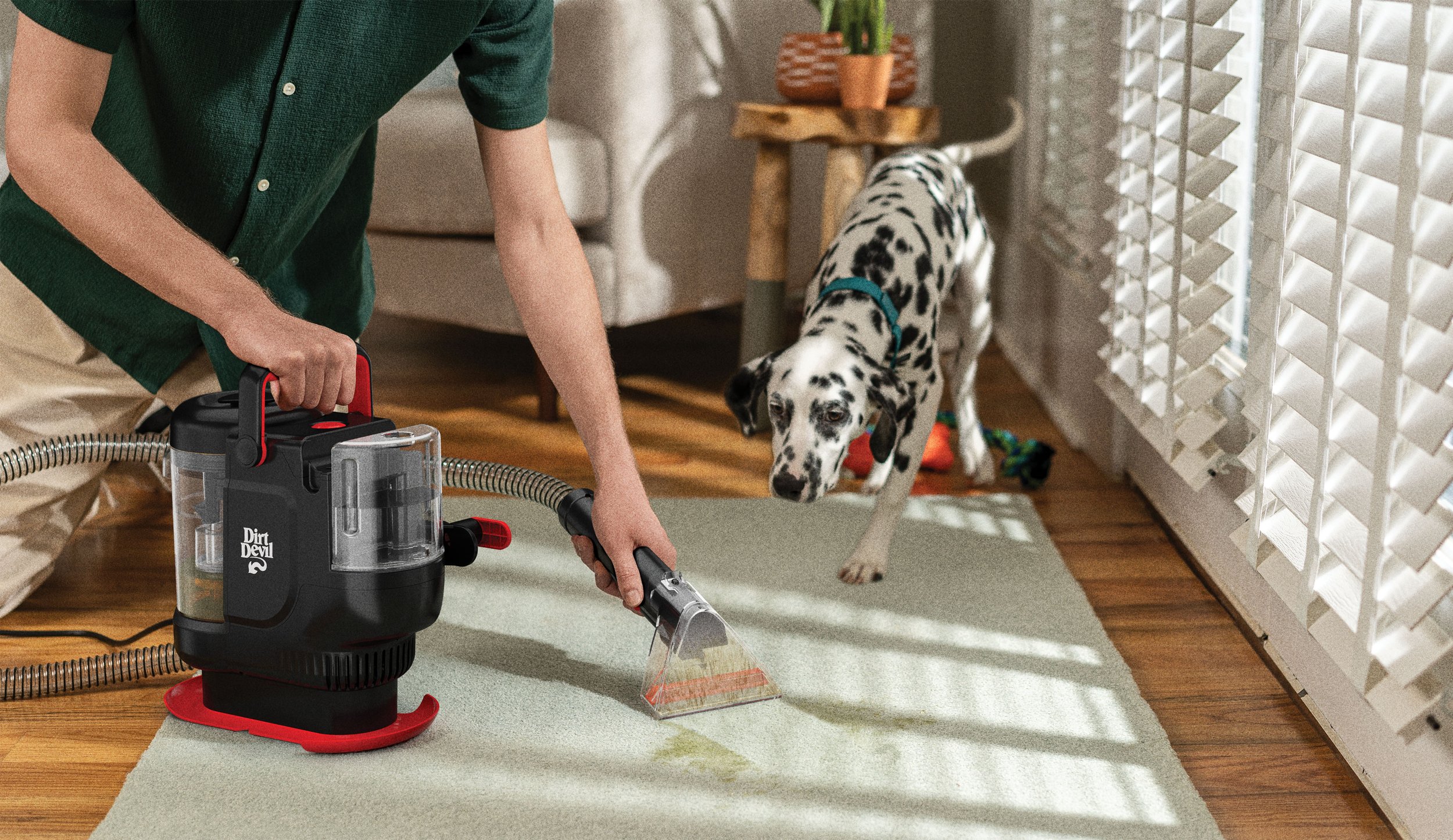
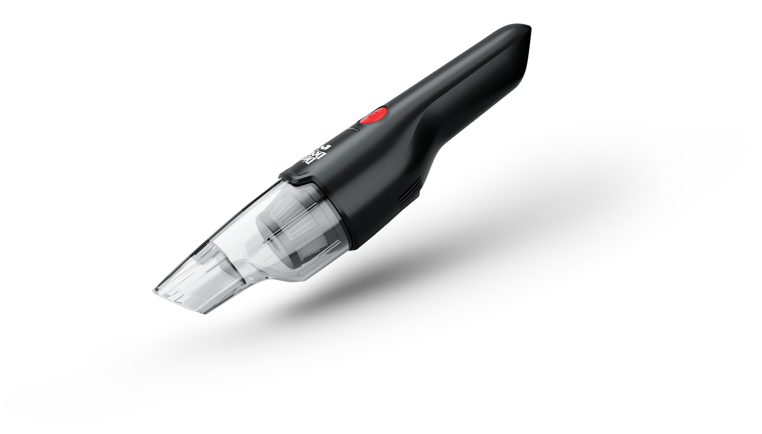
Brand Overview
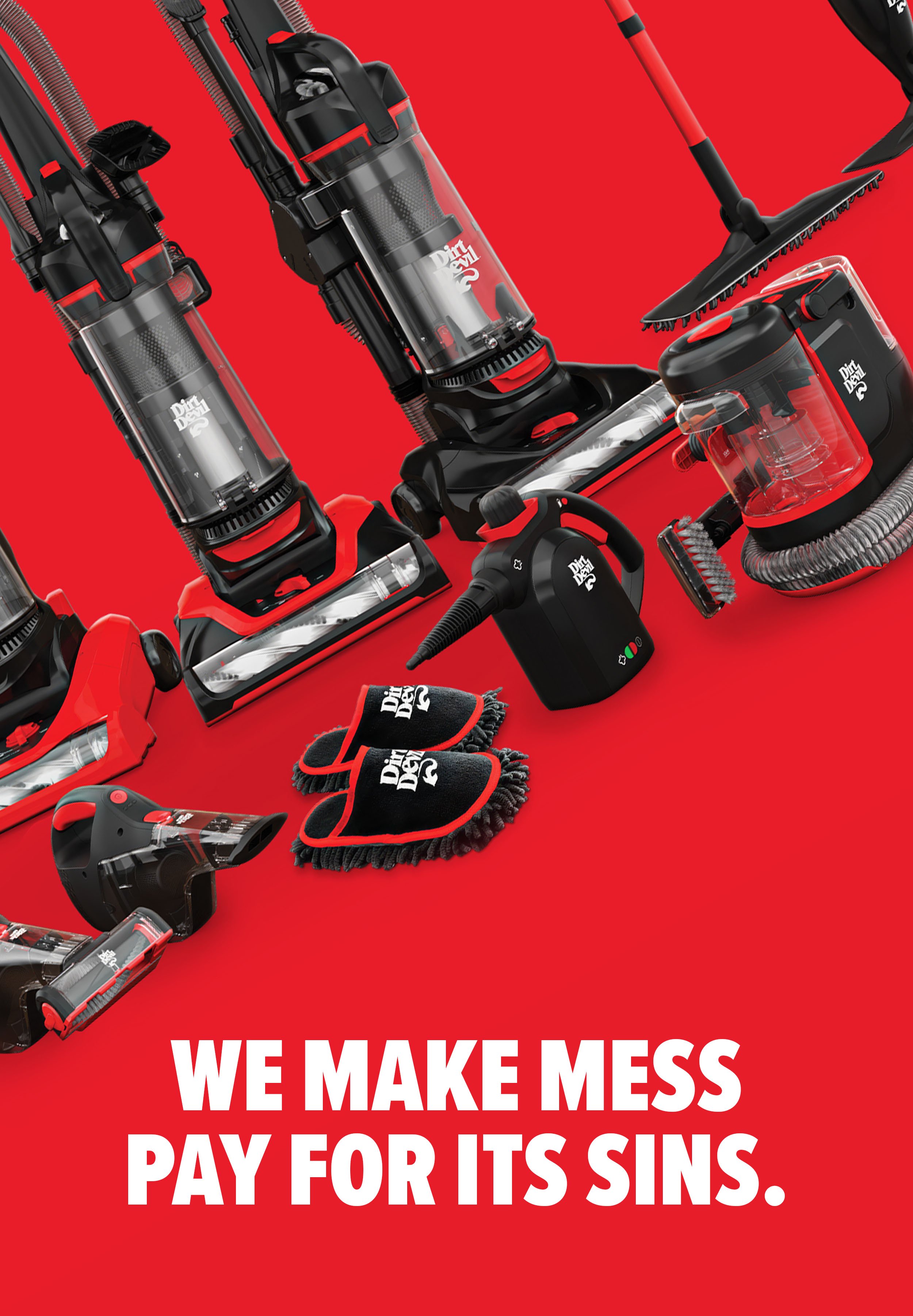
Dirt Devil embraces the truth that cleaning is a chore and focuses on creating straightforward, affordable solutions that fit the pace of busy households. Every product and touchpoint reflects a clear purpose: to make cleaning simpler, faster, and more accessible so people can get back to what they actually enjoy. With a bold visual identity, a confident voice, and a no-gimmicks approach, Dirt Devil stands out as the brand that helps keep life clean without complicating it.
Logo + Standards / Art Direction
Logo
The Dirt Devil logo rebrand modernizes the mark while preserving its legacy. By refining letterform relationships, rounding the serifs, and amplifying the signature tail, the updated logo achieves a more balanced and contemporary presence. The result feels confident and honors decades of recognition while moving forward with a more contemporary edge.
Before
After
Typography
Proxima Nova Extra Condensed

Proxima Nova
Color Palette
DD Hotter Sauce Red
CMYK: 02, 100, 95, 00
#E81D2A
DD Black
CMYK: 60, 40, 40, 100
#1A1A1A
DD Dark Gray
CMYK: 65, 58, 57, 37
#4D4D4D
DD Light Gray
CMYK: 04, 02, 02, 00
#F2F2F2
Creative Director: Sean-Paul Brown
Photography/CGI: Gary Hughes